Walk into the wrong hobby space and you'll know within five minutes. Maybe it's the guy who corrects your terminology before you've finished your sentence. Maybe it's the Discord server where every channel is locked and there's no obvious place to just say hello. Maybe it's the maker space with no pricing info on the website and a front desk that looks at you like you're lost.
That feeling — the one that says you don't belong here yet — is not an accident. It's the result of design choices, even if nobody made them intentionally.
The good news? Welcoming spaces aren't accidental either. The hobby communities that consistently bring in new members and keep them around are doing specific, learnable things. And whether you're building a community or just trying to find one worth joining, knowing what to look for changes everything.
The First Impression Problem
Most hobby communities lose potential members in the first 60 seconds. That's not an exaggeration — it's just how humans work. We're constantly scanning new environments for signals about whether we're welcome, and we make those assessments fast.
For digital spaces, that first impression is usually the landing page, the server description, or the pinned post at the top of the feed. For physical spaces, it's the entrance, the signage, and whoever is at the front.
The best communities treat first impressions as a design problem, not a personality problem. They don't just hope that whoever's working the front desk that day is friendly. They build systems: a clear welcome message, a visible "start here" channel, a greeter role in their Discord, a physical sign at the maker space that says "New? Come find us first."
This sounds obvious. It's remarkable how many communities skip it entirely.
Pricing Transparency Is Accessibility
Here's something that doesn't get talked about enough in hobby community design: hiding your pricing is an accessibility issue.
A lot of hobby spaces — especially local ones like ceramics studios, maker spaces, and climbing gyms — bury their membership costs or don't post them at all. The assumption seems to be that serious people will ask. But what that actually does is filter out anyone who's price-sensitive, which in practice means filtering out younger hobbyists, people new to the area, and anyone who's been burned by surprise costs before.
Inclusive hobby spaces put their pricing front and center. They offer tiered options where possible. They explain what's included, what's not, and whether there are ways to access the space at lower cost — volunteer hours, work-trade programs, introductory trials. This isn't just good marketing. It's a signal that the community understands financial reality and isn't gatekeeping through cost obscurity.
The same principle applies online. If a community has a paid tier, saying what's in it versus the free version matters. If there's a paid course or resource, being upfront about the price before someone's already invested time in the community is a basic courtesy that builds trust.
Channel Architecture in Digital Spaces
Spend any time on Discord and you'll notice a massive range in how servers are organized. Some are intuitive and welcoming. Others feel like you need a map and a security clearance.
The communities that consistently do well for newcomers tend to follow a few simple principles:
Start with fewer channels, not more. A server with forty channels before you've even verified your account is overwhelming. The best onboarding experiences start with a small number of clearly labeled spaces: a welcome channel, a general chat, maybe one or two topic-specific areas. More can come later, once members are oriented.
Make the "newbie" space genuinely welcoming. A lot of communities have an introductions channel that's technically there but practically dead. Nobody responds to new posts. The channel sits there as a formality. High-retention communities treat their introductions channel as a priority — members are encouraged to respond to new arrivals, and moderators often lead by example.
Separate skill levels without creating hierarchy. It's fine to have beginner and advanced spaces, but the framing matters enormously. "Beginners Corner" feels condescending. "Getting Started" feels like an invitation. These are small word choices with real psychological impact.
Moderation as Hospitality
The single biggest factor in whether a hobby space feels safe? Moderation. Not just what the rules are, but how they're enforced and who's doing the enforcing.
There's a style of moderation that prioritizes protecting the existing culture above everything else. It tends to be reactive, inconsistent, and heavily weighted toward established members. If a veteran member makes a newcomer feel stupid, nothing happens. If a newcomer asks a question that's been answered before, they get a curt "check the FAQ."
Inclusive communities flip this. Their moderation is proactive — moderators are looking for chances to make people feel welcome, not just waiting for violations. They enforce rules consistently regardless of member tenure. And critically, they treat "this person made me feel dumb" as a moderation issue, not just a personality conflict.
Some of the best hobby communities in the US have moved to a model where moderators are explicitly trained in conflict de-escalation and welcoming practices. It sounds formal, but even a two-page guide for volunteer mods can make a dramatic difference in community culture.
Physical Spaces: The Details That Signal Welcome
For brick-and-mortar hobby spaces — maker spaces, art studios, game stores, community gardens — the physical design carries a lot of the same weight.
A few things that consistently show up in genuinely inclusive physical hobby spaces:
Visible skill-level labeling on tools and equipment. Knowing which machines are beginner-friendly versus which require certification removes a huge anxiety point for new members.
Designated "ask for help" zones or people. Having a specific person or space designated for questions normalizes asking. It removes the fear of interrupting someone who looks busy.
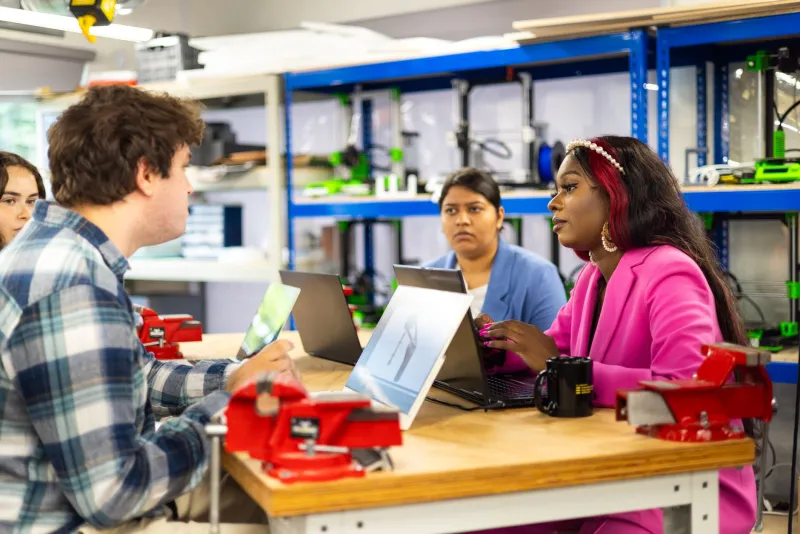
Seating that encourages mixing, not segregating. Community tables where people naturally end up next to strangers tend to produce more cross-pollination than rows of individual workstations.
Visible representation. This one matters more than most space designers realize. If every photo on the wall, every example project on display, and every person in the promotional materials looks the same, that sends a message about who the space is really for.
What You Can Do Right Now
If you're running a community — online or off — here's a quick audit to try: ask someone who joined in the last 30 days to walk you through their first hour of experience. What confused them? What made them feel welcome? What almost made them leave?
If you're looking for a community to join, use these same principles as filters. A community that makes its pricing clear, has a visible welcome structure, and actively moderates for kindness isn't just better for newcomers — it tends to be a better community overall, for everyone at every level.
The best hobby spaces don't happen by accident. They're built, maintained, and constantly improved by people who understand that welcoming someone isn't a one-time gesture. It's an ongoing commitment.